Design da linha de embalagens | Molhos Granfino
Packaging line Design | Granfino Sauces
[PT]
A ideia do reposicionamento e da modernização das embalagens veio da necessidade de mudar a comunicação visual de uma linha de produtos que, entre os populares, eram os que tinham o maior preço no PDV. O objetivo era ter uma pegada mais sofisticada e atraente e assim ter mais competitividade entre os produtos de maior valor agregado.
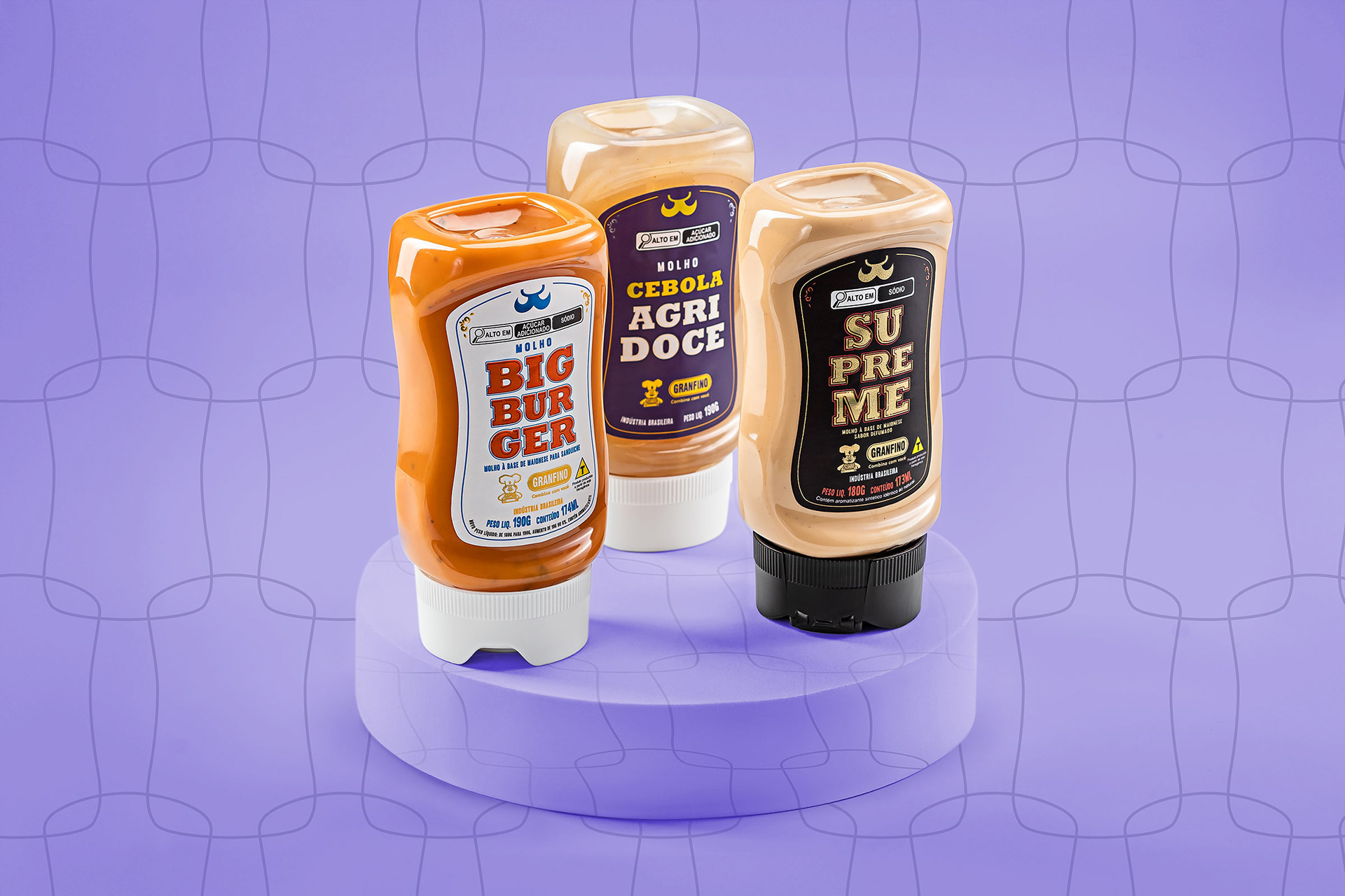
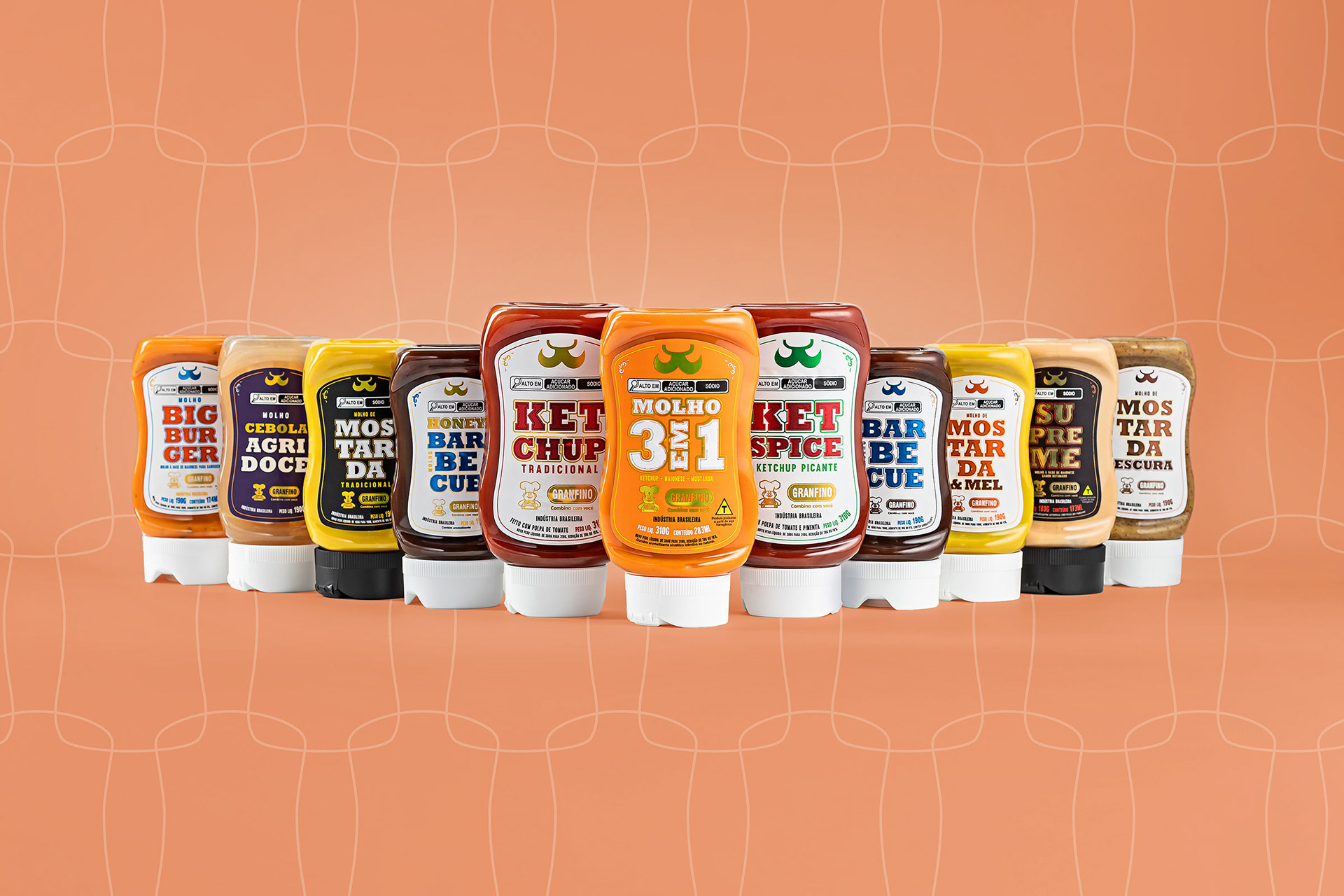
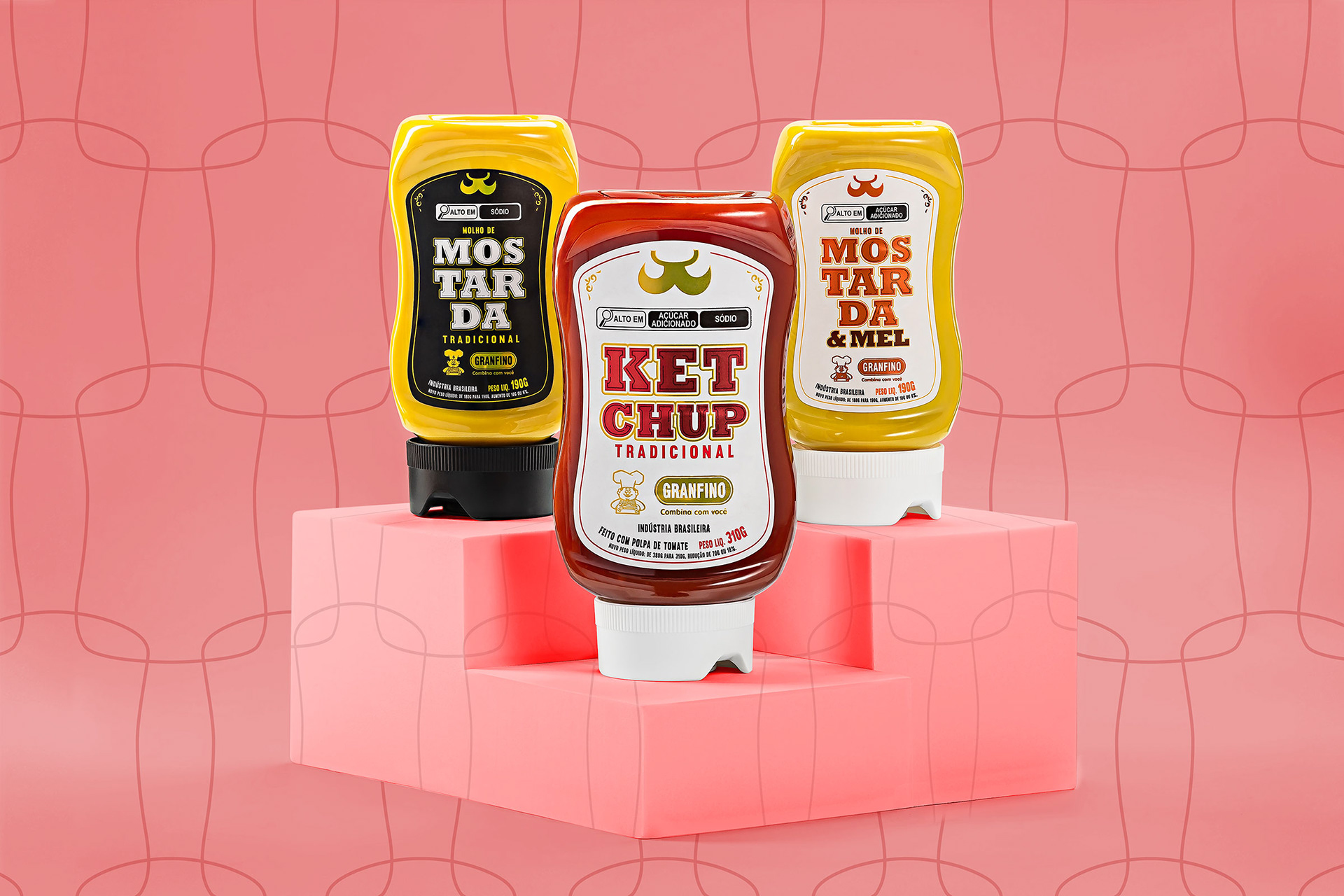
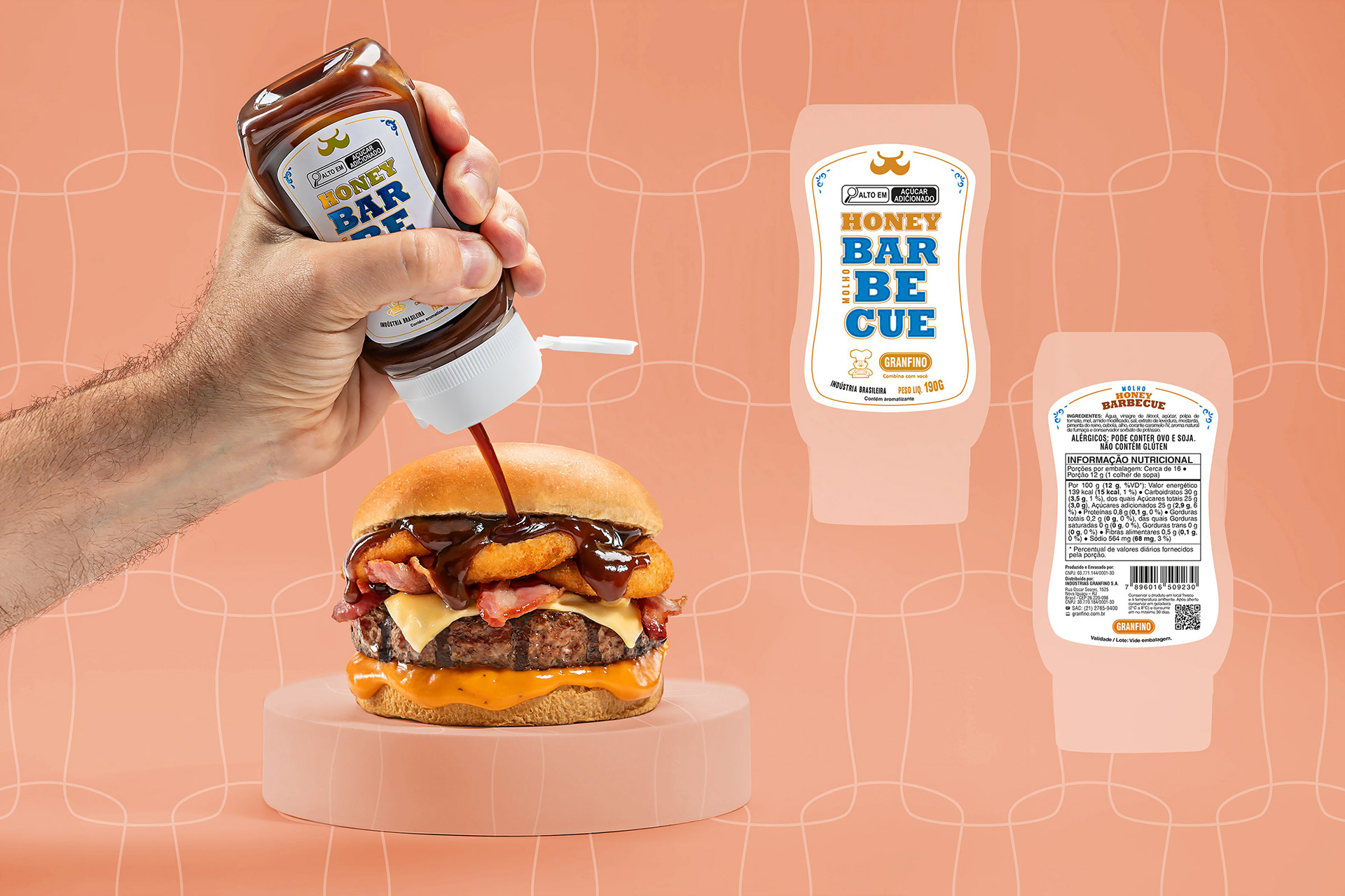
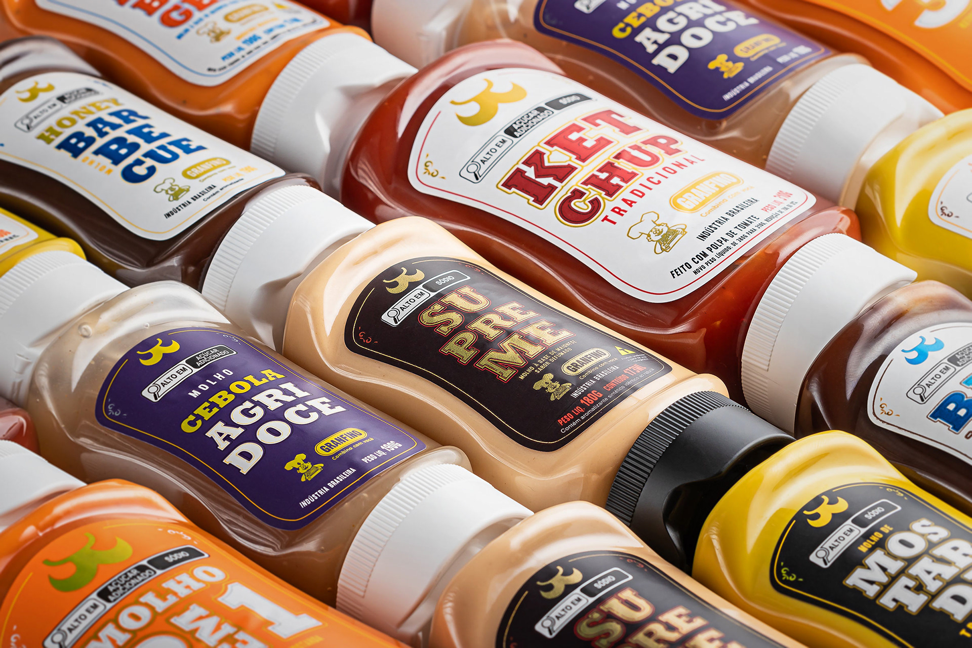
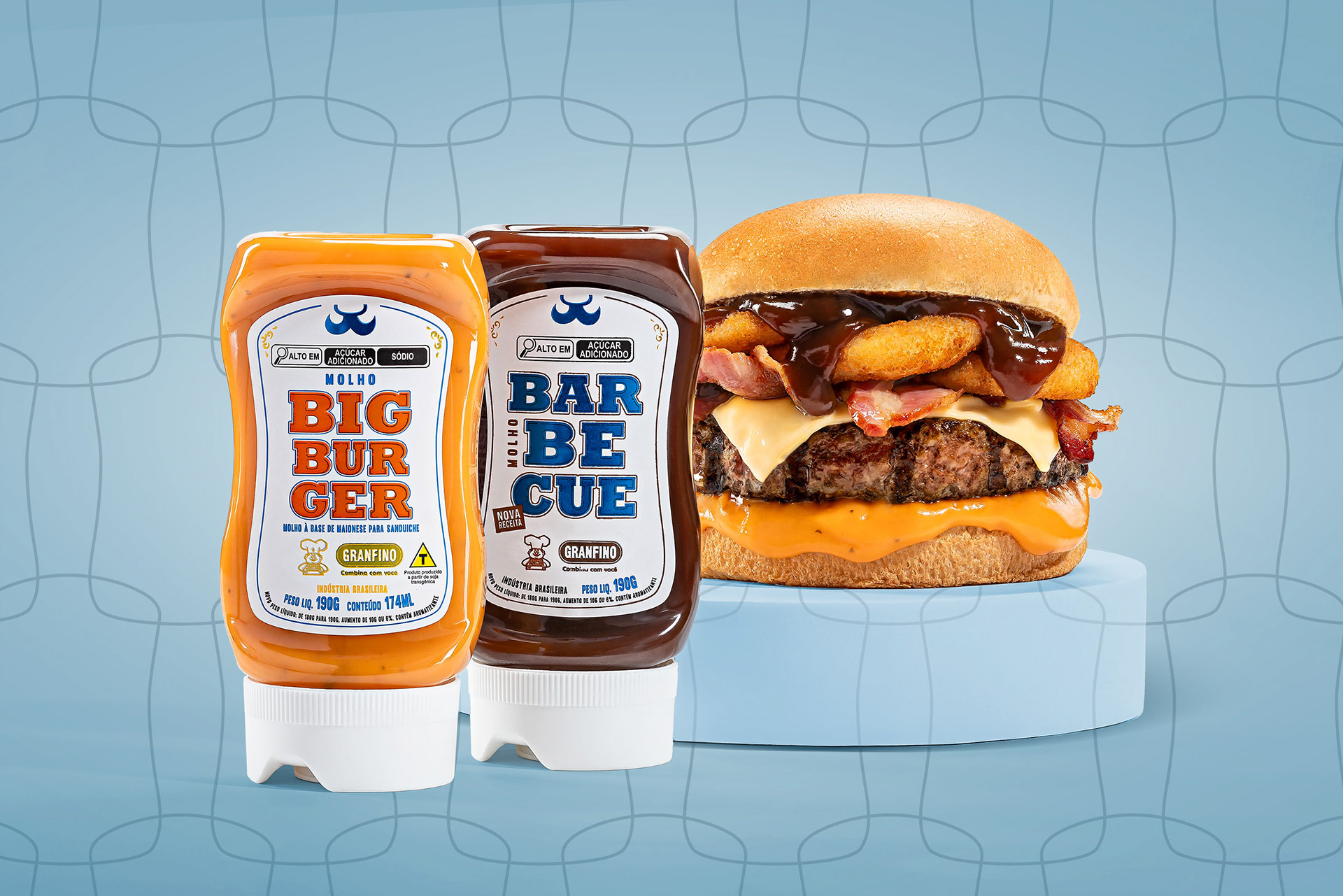
Eliminei as imagens e optei por um layout “all type” com alguns adornos e outlines para compor a arte, inclusive em conjunto com a tipologia.
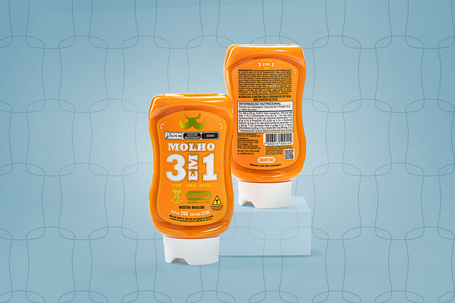
Foi escolhida a assinatura de marca horizontal com tons metálicos para transmitir refinamento.
Como elemento de apoio, usei o “bigode”, que é parte do cozinheiro, símbolo da Granfino.
A maior área de fundo branco, predominante na maior parte dos rótulos da linha, foi pensado para se destacar na gôndola.
A expectativa é de que com essas mudanças e com o esforço de vendas a linha seja positivada em todos os clientes TOP60 e que o volume de vendas aumente em 4 vezes.
[EN]
The idea of repositioning and modernizing packaging born the need to change the visual communication of a line of products that, among the popular ones, had the highest price at the POP. The objective was to have a more sophisticated and attractive design and to be more competitive among products with higher added value.
I eliminated the images and choose a “all type” layout with some decorations and outlines to compose the art, including the typology.
A horizontal brand signature with metallic tones was chosen to convey refinement.
As a supporting element, I used the “moustache”, which is part of the chef, a symbol of Granfino.
The largest area of white background, predominant on most of the line's labels, was designed to stand out on the shelf.
The expectation is that with these changes and the sales effort, the line will be positive for all TOP60 customers and that the sales volume will increase by 4 times.